“Despite the forecast, live like it’s Spring.” ― Lilly Pulitzer
Take three deep breaths – in through your nose, out through your mouth. One … two … three. Transformative isn’t it? It’s amazing how something so simple can so easily change your state of mind.
Same goes with colour. The colour geniuses at PANTONE have created a Spring colour report that will help you breathe easy after those cold, winter months.
These 10 Spring colours are designed to transport and transform us, with brights providing excitement and optimism and more subtle, dusty tones offering quiet stability.
And that’s what Spring is about, isn’t it? New life. New beginnings. Now breathe …
1. Rose Quartz – PANTONE 13-1520
Channel passion and composure. Take time to reflect on your surroundings.
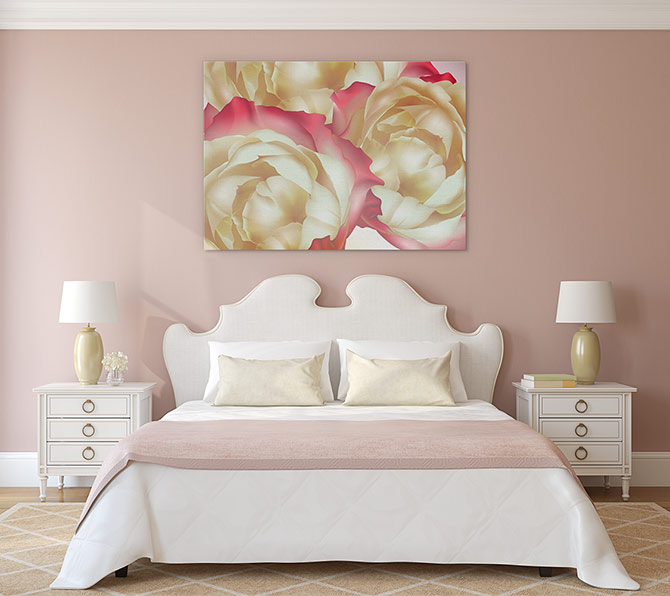
GENTLE: This contemporary ‘Tea Roses’ print complements the lighthearted feel of this rose quartz decor.
From Habitissimo, below.
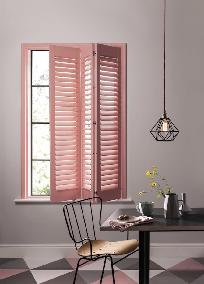
SERENE: Shutters and flooring get the rose quartz treatment, creating a soothing ambience.
2. Peach Echo – PANTONE 16-1548
Part of the lovable orange family, playful peach echo is friendly, warm and accessible.
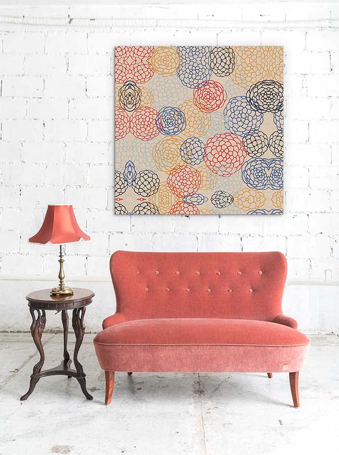
WARM: Peach echo loves art deco, so combine this ‘Japanese Deco’ pattern print with vintage delights for a friendly feel.
From My Domaine, below.
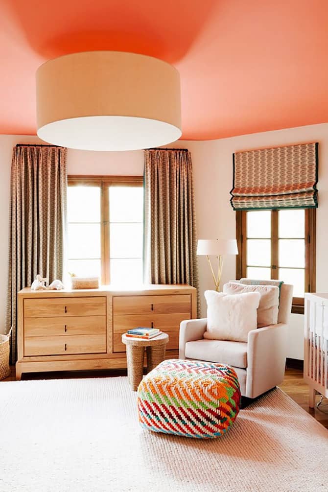
FRIENDLY: Fall in love with orange all over again with a shade of peach echo paint on your ceiling.
3. Serenity – PANTONE 15-3919
Use serenity to keep calm during turmoil and connect with a sense of space.
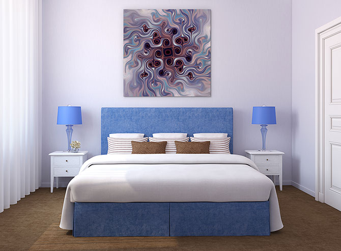
WEIGHTLESS: Half of Pantone’s colour of the year, this ‘Emerging From Within’ contemporary print shows how versatile the serenity colour can be.
From Tudo Orna, below.
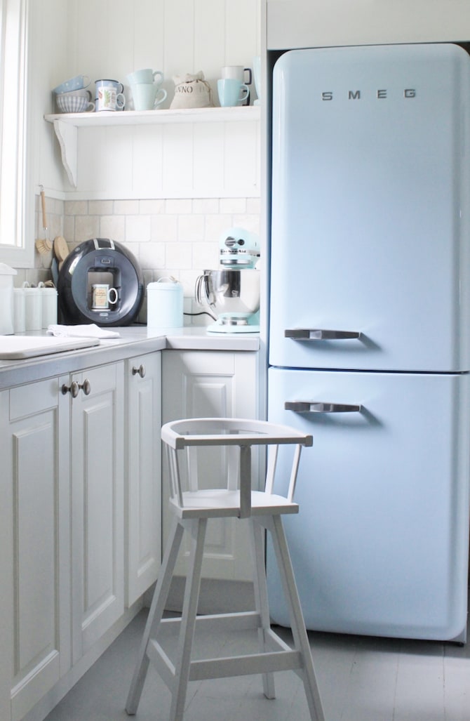
RESPITE: How chill is this kitchen, the epitome of serenity’s ability to appear weightless and airy.
4. Snorkel Blue – PANTONE 19-4049
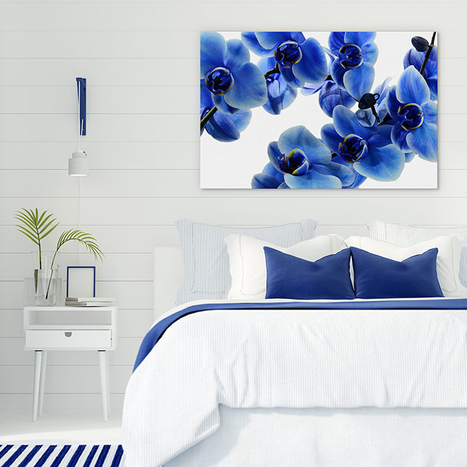
Energise, escape and relax with snorkel blue, a happier colour than navy that will remind you of holidays.
From Relics Of Witney, below.
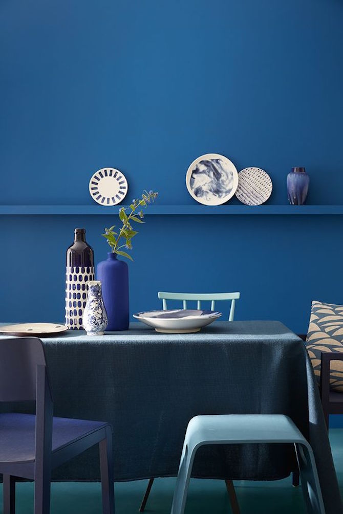
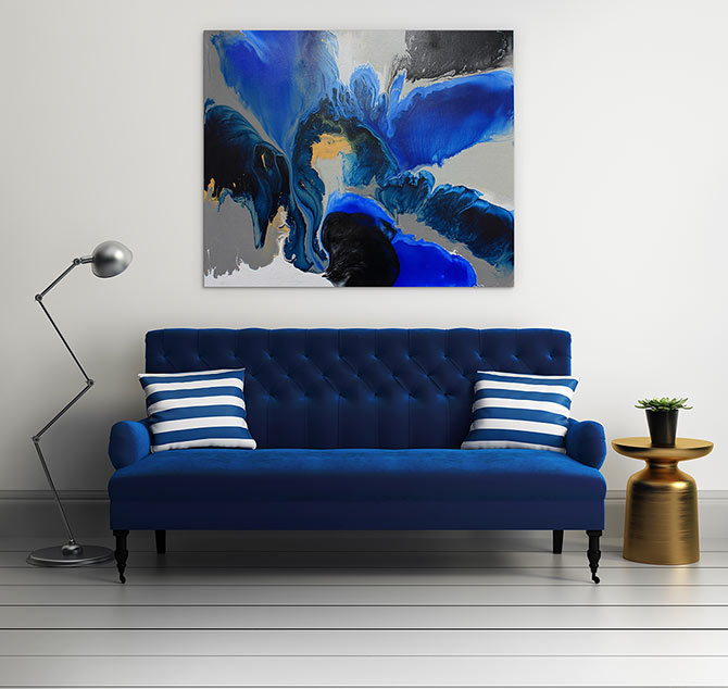
STRIKING: You can never get enough snorkel blue, so let the colour take over your heart and home.
5. Buttercup – PANTONE 12-0752
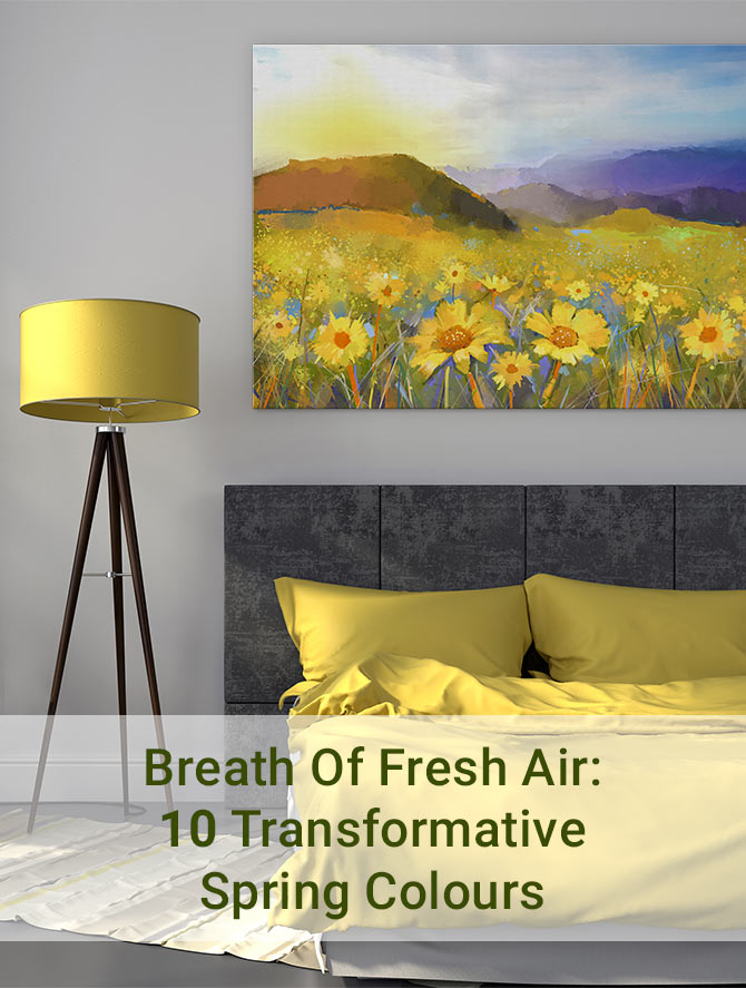
Transport yourself to a happy, sunny place each and every day with bright, bubbly buttercup.
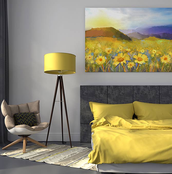
BRIGHT LIGHT: Transport yourself to a happier place by adding this gorgeous landscape print ‘Daisy Meadow Sunset’ to a decor dappled with brilliant buttercup.
From Patzer, below.
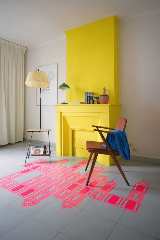
SUNNY: Buttercup is a wonderful colour to contrast with neutrals and other brights, so be brave and make it a feature.
6. Limpet Shell – PANTONE 13-4810
Fancy creating some mindful tranquility? Limpet shell, part of the aqua family, suggests clarity and freshness.
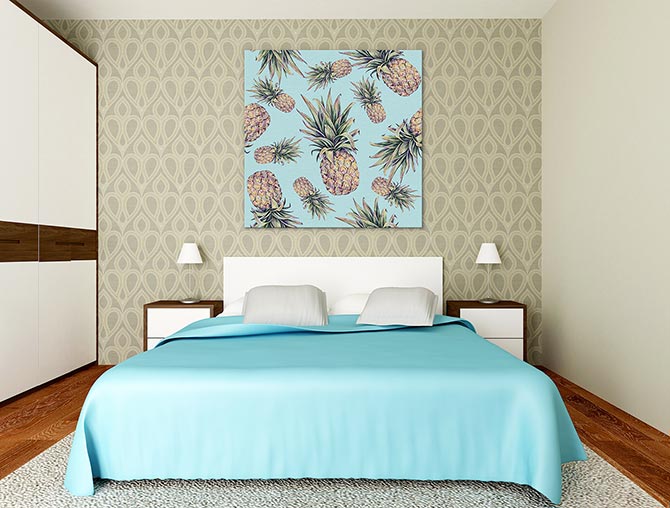
FRESH: There’s something about this ‘Retro Pineapples’ that adds fun to an otherwise calm limpet shell decor.
From Orlean on Pinterest, below.
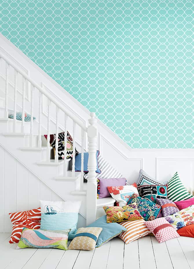
CRYSTAL CLEAR: Fully embrace this crisp, modern Spring colour by decking the walls with limpet shell paint or wallpaper.
7. Lilac Grey – PANTONE 16-3905
Don’t be afraid to invite neutral colours into your home in Spring. This lilac grey is much edgier than the standard stone.
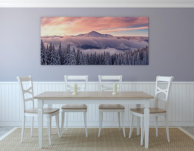
EDGE: Make neutral on neutral work with this ‘Soft Mountain Sunrise’ print, made possible by lilac grey.
From Blog Lovin’, below.
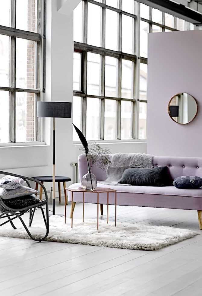
BEAUTIFUL: For a modern boho decor, use luxurious lilac grey as an edgy neutral.
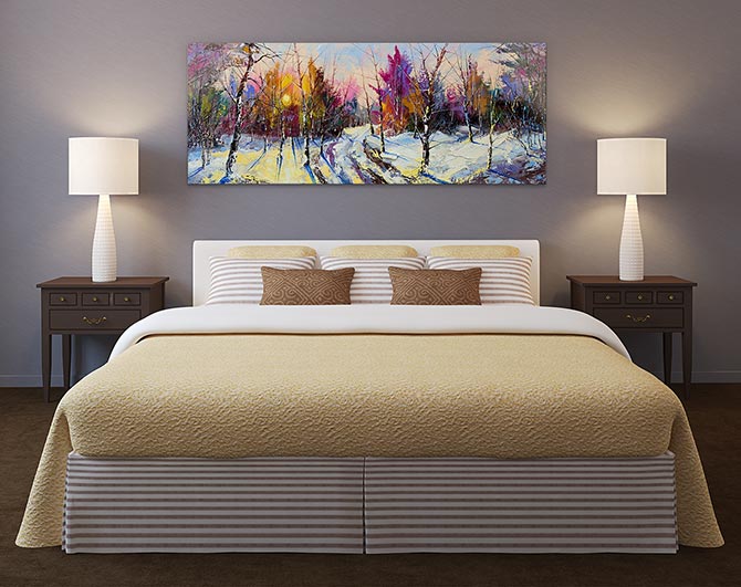
ILLUSIVE: The brights in this ‘Sunset In Winter Woods’ print nicely round off the subtle lilac grey wall paint, adding a sense of wonder to the bedroom.
8. Fiesta – PANTONE 17-1564
Spring is nature’s way of saying ‘Let’s Party!’ – Robin Williams
Add free-spirited excitement to your home – a spring in your step! Firey fiesta is a fun contrast to the season’s more subtle tones. We all need to party, right?
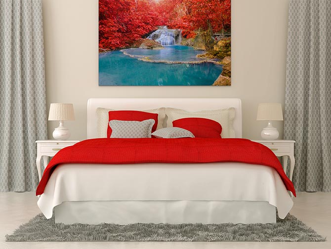
FIREY: Turn a red, white and grey decor into something even more glorious with this triumphant ‘Autumn At Erawan Waterfall’ landscape photo print.
From Home You, below.
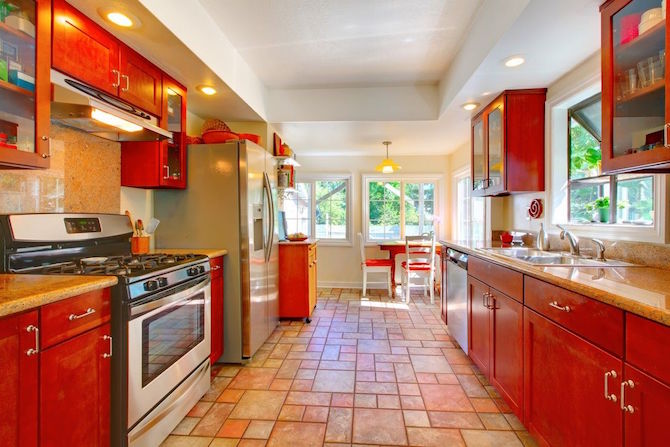
WOW: Bounce your way into Spring all year round, using the strong fiesta colour in your kitchen.
9. Iced Coffee – PANTONE 15-1040
Wake up and smell the coffee. Breathe it all in. A natural and earthy tone, Iced Coffee, makes for a strong neutral foundation.
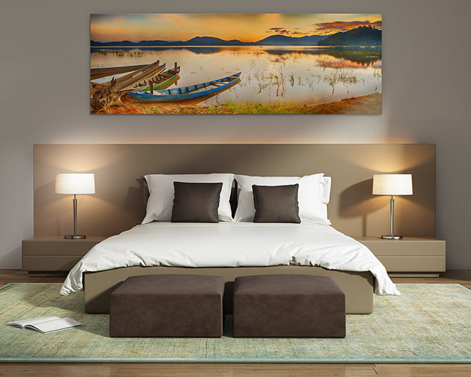
SOFT: Ease into a deep sleep with this sublime ‘Rowing Boats At Sundown’ print, surrounded by iced coffee goodness.
From Archiproducts, below.
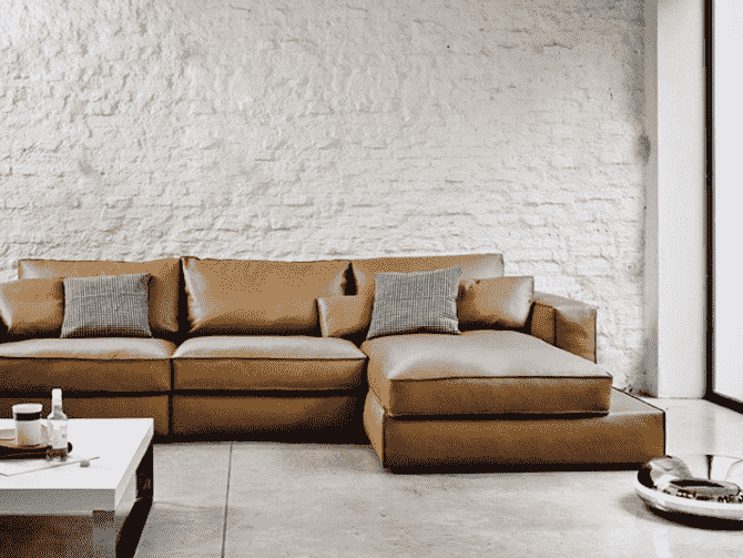
RELAX: This impressive iced coffee lounge suite with help you breathe easy, with neutrals abound.
10. Green Flash – PANTONE 15-0146
Escape the mundane by bringing a flash of green inside your home. Ready to surprise yourself?
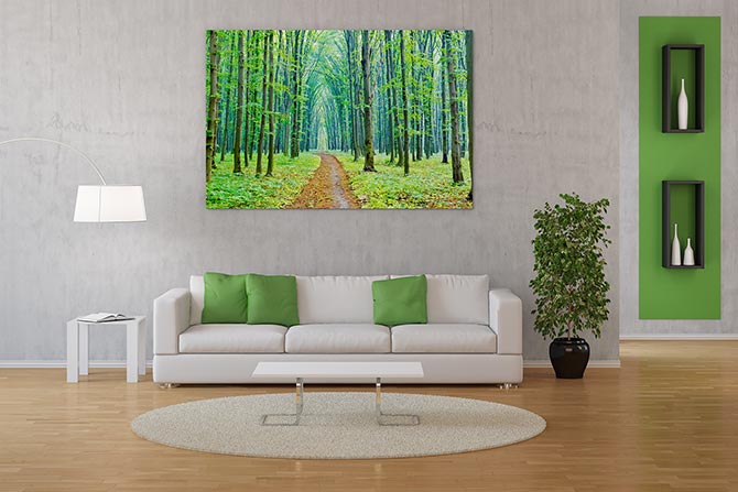
ESCAPE: Take a walk down this ‘Vibrant Spring In The Forest’ tree tunnel from the comfort of your living room.
From B+C, below.
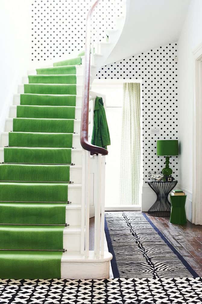
EXPLORE: Discover how brilliant the green flash hue is by adding it to unexpected places in the home.

