Without a doubt choosing the right colour combinations are a key factor in home decor. It’s that important first step that hinges all other aspects of design.
It can be really hard choosing the right colour palettes for the right room, so we’ve pulled together some standouts that remain current and beloved, despite ever-changing trends.
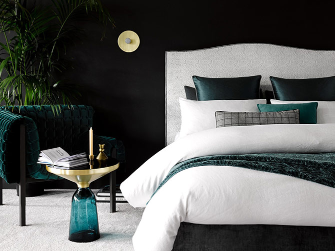
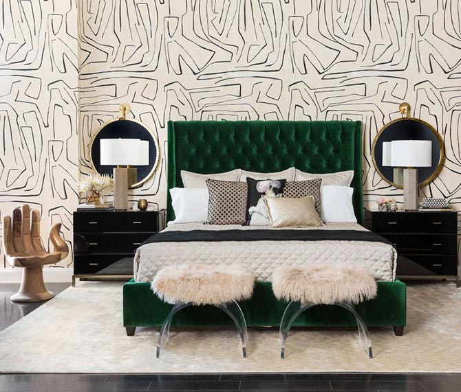
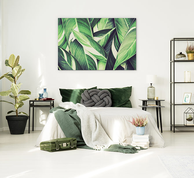
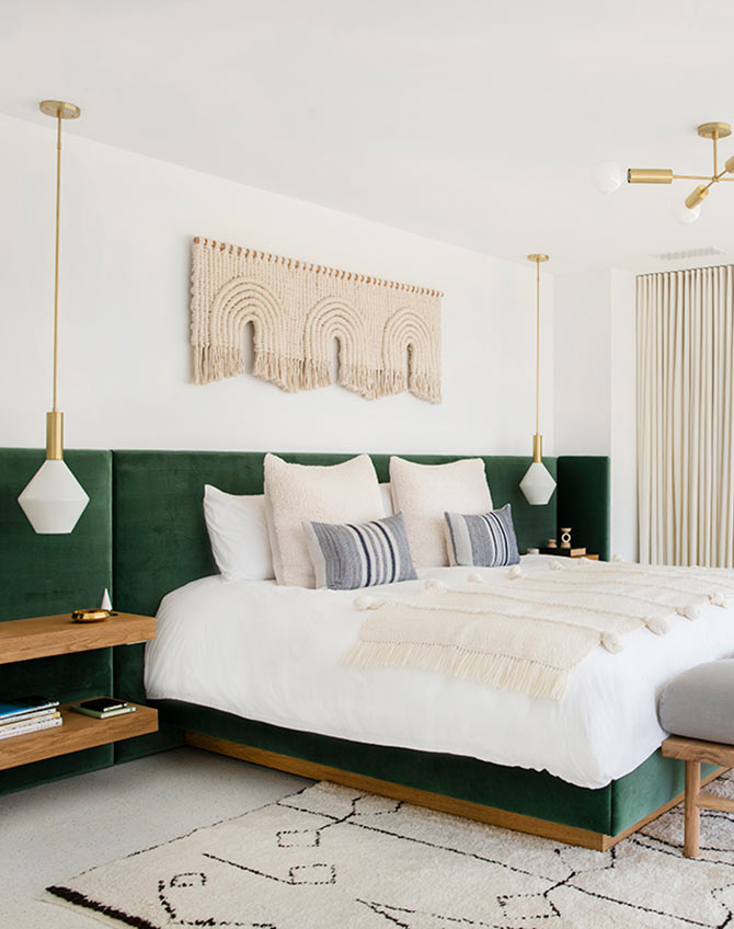
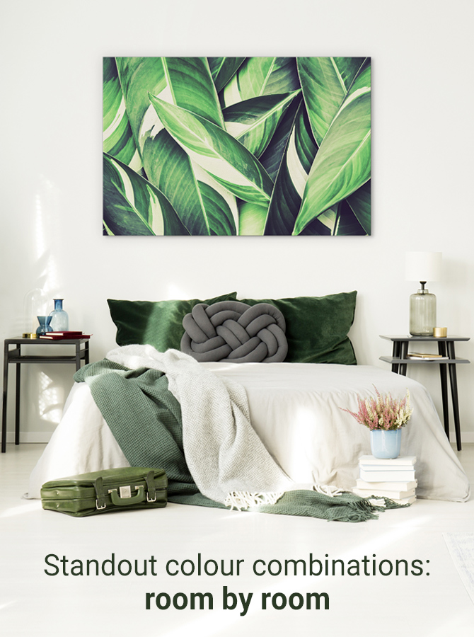
So much serenity: Emerald and cream in the master bedroom
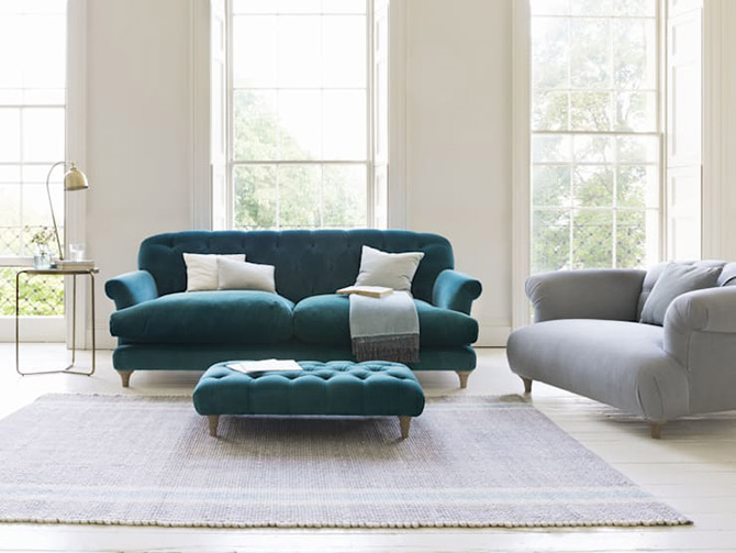
Green is a universal colour loved for its refreshing and restorative qualities. It makes sense that bringing this beloved colour into the bedroom will enhance your much needed relaxation.
‘Colour psychology plays a crucial role in choosing interior colours and is particularly important when the space is designated for relaxation, such as a bedroom or formal lounge. Green is the colour of life and the silent power of nature which promotes calmness, serenity and security.’ Ally Daley, Interior Designer from Upstyled Interiors.
Purporting opulence and wealth— just like its namesake— this billion year old gemstone invites such jewel like qualities into your home. With a great blend of restoration and decadence the moment you walk into the room, emerald and cream might just be the colour combination you’re seeking!
‘The soft, calming color of the emerald helped early lapidaries rest their eyes after an extended period of concentration. Today, emerald is still thought to relax and relieve eye strain,’ The Spruce Crafts reports.
Because green is such a dazzling colour, it needs a soft and reflective base to balance it out, which is why we suggest cream as one of our all time favourite colour combinations.
Go bold: Add textured features such as macrame, dreamy bedroom art, super low hanging pendant lighting or funky wallpaper to add some dazzle to your bedroom.
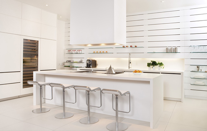
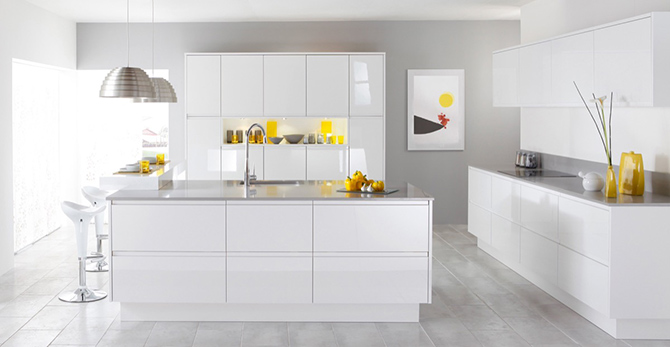
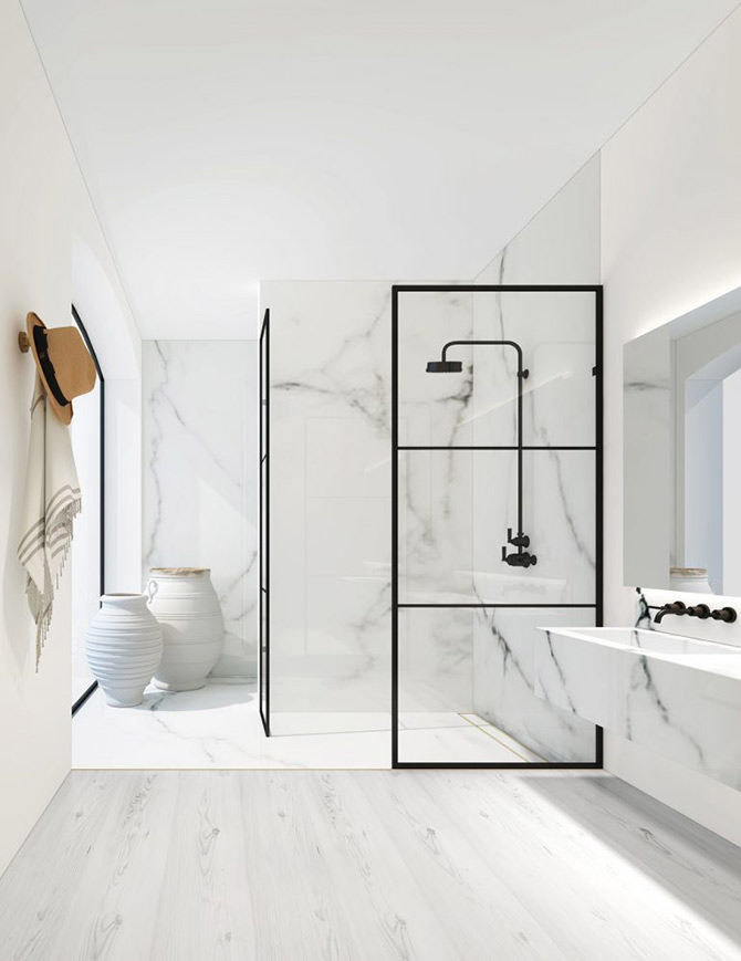
White out: white and more white in the kitchen
Okay, so not a combination per se but definitely worth mentioning because of its enduring appeal and spotless as a base or design concept as a whole.
A white kitchen can look just as modern in twenty years as it does today, which is by far one of the most appealing aspects of this colour combination.
The best thing about a completely white kitchen is the flexibility it offers. Effortlessly stunning today and yet so incredibly easy to update when the time comes for a change, simply by incorporating a few pops of colour.
Go bold: Add a few lemon yellow accents for an easy refresh.
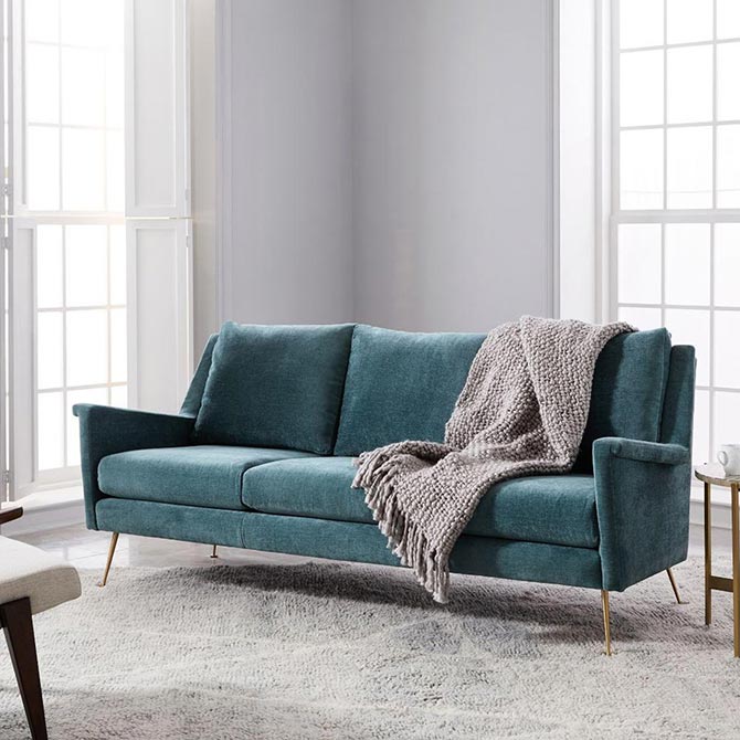
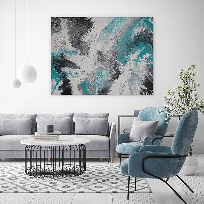
Tiffany’s at home: teal and dove grey in the living room
This colour combination is calming and gentle. It particularly works for a common area as it’s welcoming for people of all ages and will withstand the wear and tear of daily life.
Grey offers the utmost versatility as you can use it as a wall colour or introduce grey furnishings such as a floor rug, couch and cushions. Additionally, you can layer as many grey shades as your heart desires – no need to stop at 50!
Using a flat paint works best for grey tones. You can either start subtly with a really light grey which provides a neutral backdrop or be daring with gunmetal grey. To avoid a dark and stormy room, be sure to introduce plenty of lighting with lamps, lights and windows.
Grey offers a touch of temperate elegance whilst the teal complements it with a luscious shade and offers depth. And it’s the colour of the infamous Tiffany’s… just in case you needed reminding.
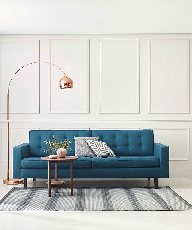
For the best results, stick to one shade of and limit the teal.
Go bold: Accents of mustard or chartreuse work really well with this colour combination, which you can incorporate through artwork, cushions or a floor rug.
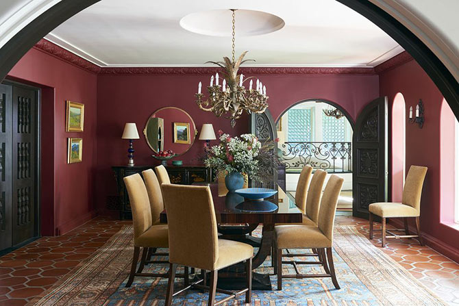
Memorable meals: burgundy in the dining room
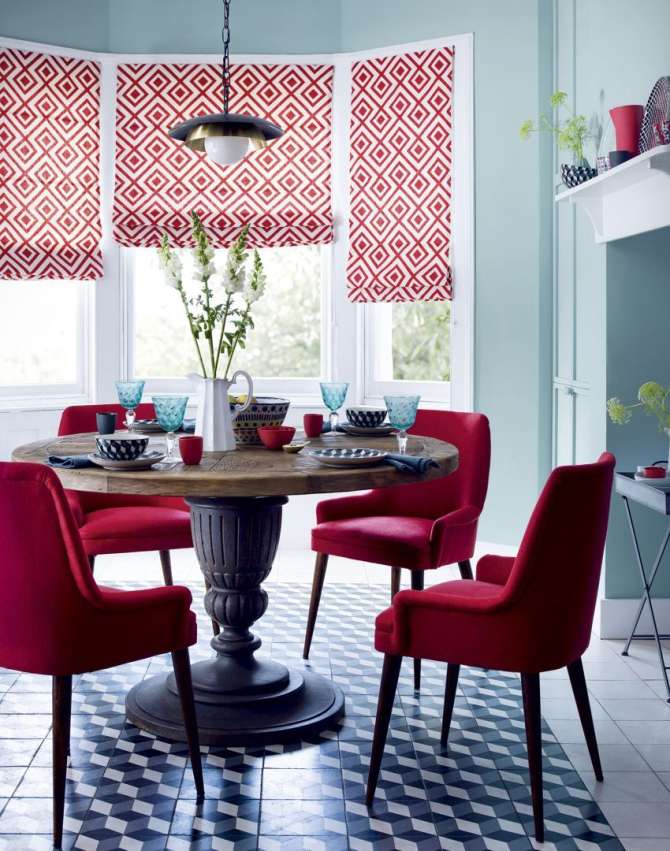
With this colour combination, the second colour is all your choice! As long as it goes with burgundy.
Burgundy insinuates an ornate and rich space – the perfect backdrop for lavish dinner parties and opulent meals with family and friends.
You can tame your burgundy theme to just the chairs or dive in with burgundy rugs, feature walls, chairs, artwork and even the ceiling!
Again, it’s crucial you add adequate lighting to avoid this colour scheme becoming dark and dingy and make it cosy instead. For added drama, add an extravagant chandelier or single pendant centred exactly above the table.
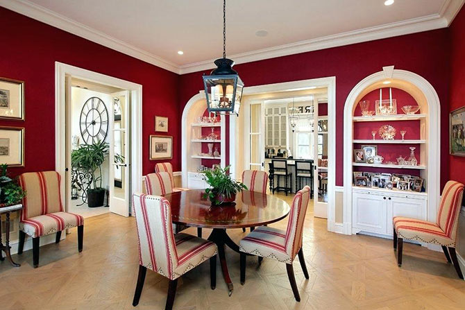
Go bold: add dashes of gold to make it all out regal.
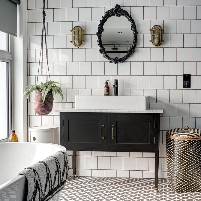
Noir chic: black and white bathroom
The classic colour combination of black and white is timeless and effortlessly chic. And there’s absolutely no reason why the sophisticated elegance can’t extend to the bathroom.
Black and white play so well together and offer the illusion that a bathroom is cleaner than it really is (as opposed to say, an all white bathroom) and honestly, who doesn’t want that?
With a nod to Art Deco style, it offers more wriggle room for lavish touches such as gilded gold, brass or more gorgeous emerald by way of banker’s lamps and fernery.
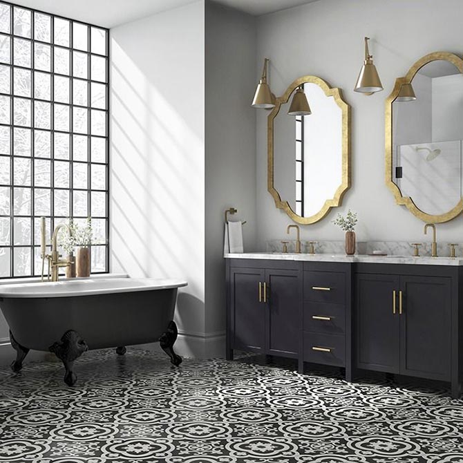
You can go wild with geometric patterns, intentional symmetry or stick to simple black touches in a white bathroom (or vice versa if you are not afraid of the dark!). The beauty of a monochrome decor is that it creates striking lines and distinction. Masterfully done, the reflections of space that both colours offer can really alter the feel of a room.
The best part? A black and white bathroom works well in any style of home, whether you have country farmhouse, modern city apartment or even a Hamptons style beachside abode.
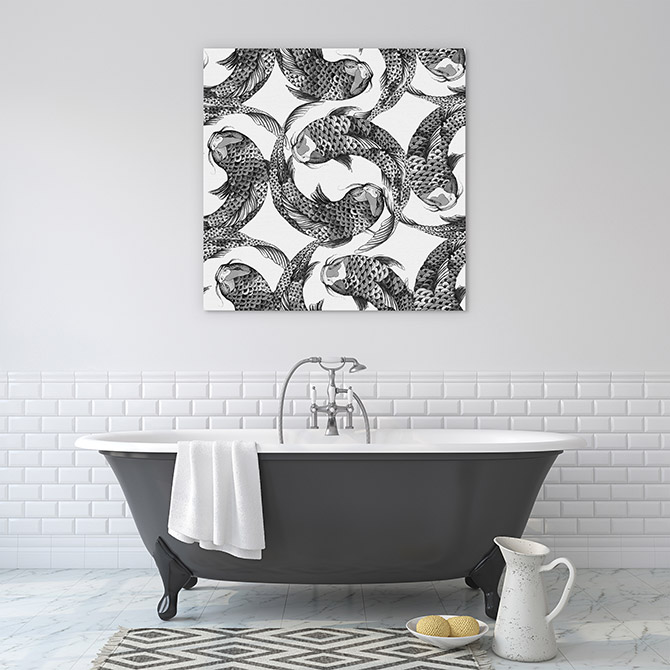
Go bold: Touches of vintage inspired items (such as a clawfoot bath or rococo mirror) really help to class up this colour combo.
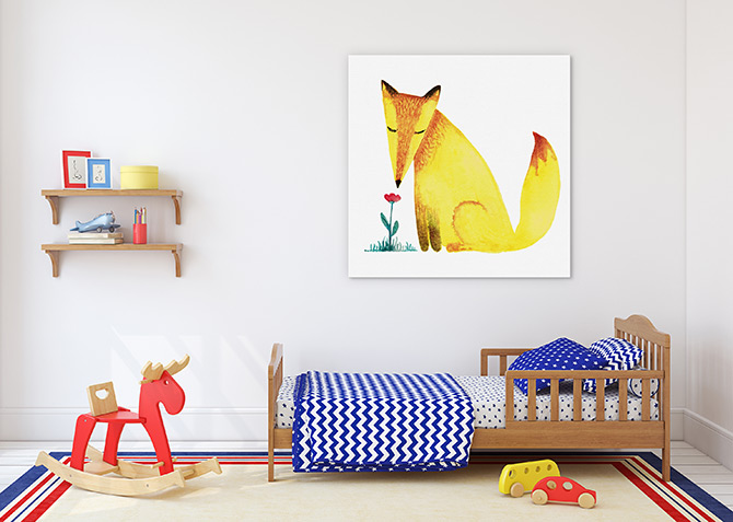
Creativity hub: primary colours in a kids room
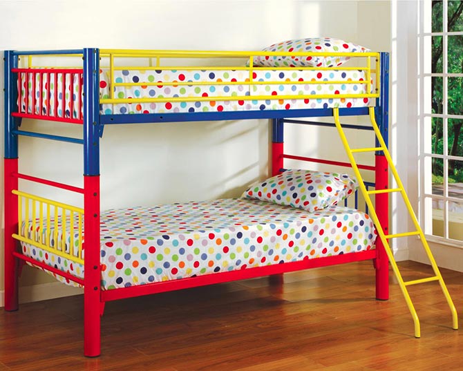
Image credit: Broadway Furniture
Kids love colour. In fact, ‘Children spend more time looking at bright colors as opposed to looking at muted shades or pastels.’
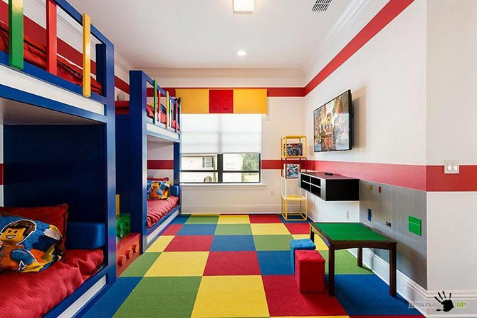
Image credit: Real Places
Blue offers relaxation, red stimulates creativity and passion and yellow certainly boosts happiness and intelligence. All great colours to incorporate in a child’s room.
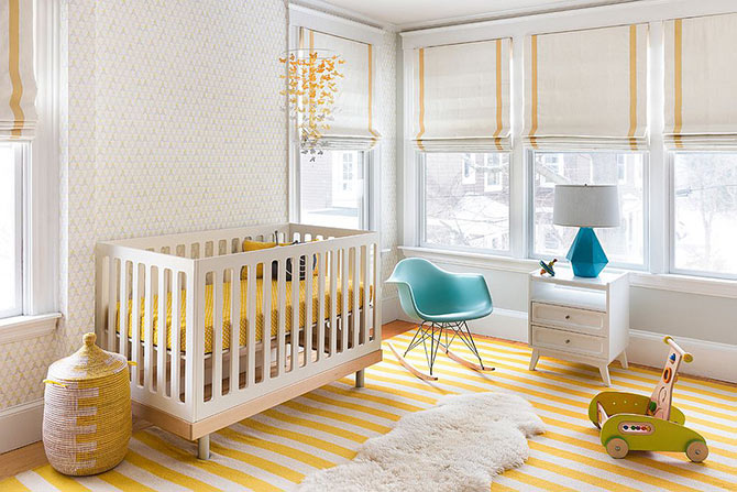
Because of their love for colour, there’s an opportunity to get super creative when it comes to colour combinations in a kid’s room. Start with a neutral base (such as light grey, white or even exposed timber) and then get enthusiastic with primary colours. Leave your restraint at the door and cut loose with cheerful pops of colour on bed linen, curtains, blinds, floor coverings, furniture and fantastical art for kids.
Go bold: start with a light lemon yellow and layer primary colours (fire engine red and cobalt blue work well). Anything that is fixed or semi fixed (think curtains, heavy furniture etc) should contain your base colour and other items can wear the colours.
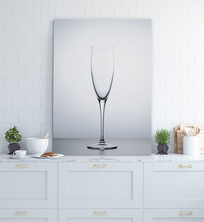
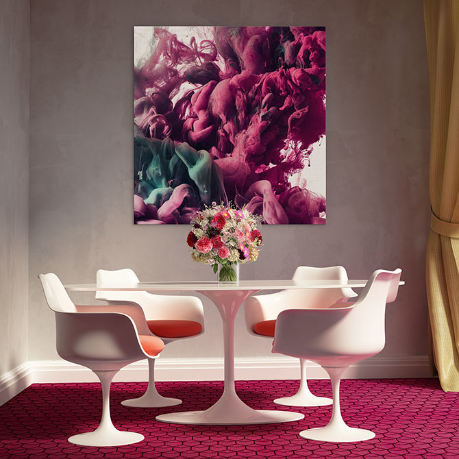
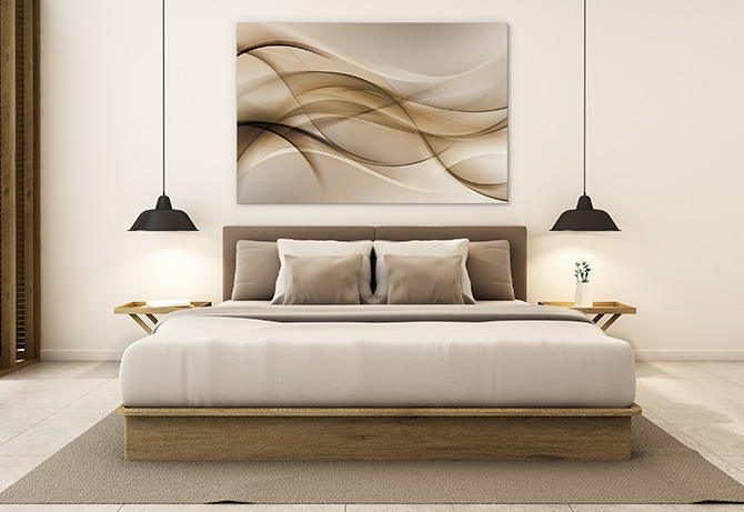
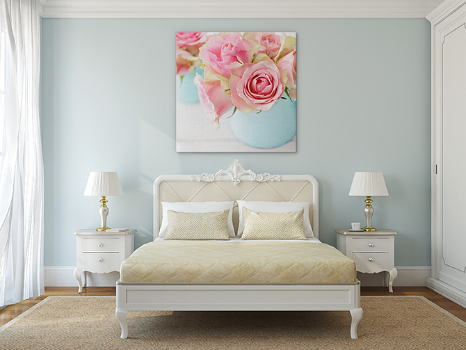
Now that you’ve nailed the perfect colour combination, don’t forget the finishing touch! A beautifully matched art print will bring the colour scheme together while adding interest and depth to the space.

