Small spaces are notoriously tricky to design, even for a master interior decorator. They require precision, understanding and an almost scientific balance between colour and proportion. Of course, sometimes structural changes just aren’t possible, though we’d all love to install a larger window or knockdown and rebuild that pesky load bearing wall.
There are, however, decisions you can make to enhance height and light. The real key to great interior design is spatial awareness and knowing how to apply your personal taste to the dimensions of your room.
1. Drop the lights
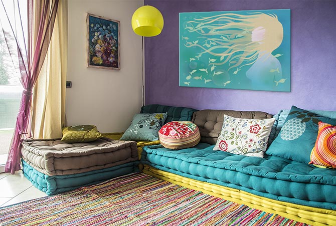
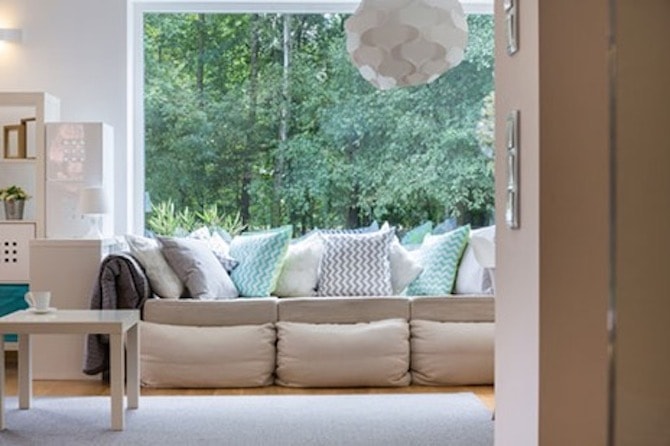
Choosing the right lighting has the potential to make any space, even a cupboard under the stairs, feel light and open. While for many years it was the spotlight that reigned king, the drop light is a welcome alternative at home over kitchen benchtops, as well as in powder rooms and study nooks.
A drop light is a perfect way to illuminate every corner of your space and, most importantly, elongate the distance to the ceiling. Many designers will tell you that lighting should always serve at least two or three purposes; to illuminate, decorate and set the mood. But it’s the fourth one, exclusive to small spaces, that is absolutely crucial; to heighten.
2. New artistic heights
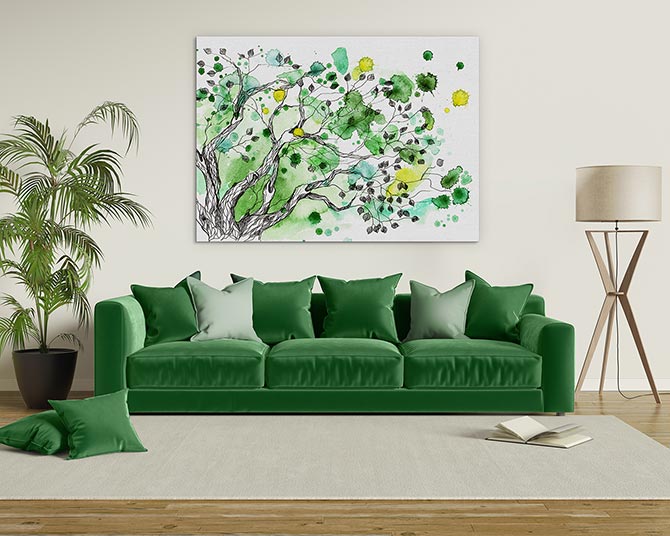
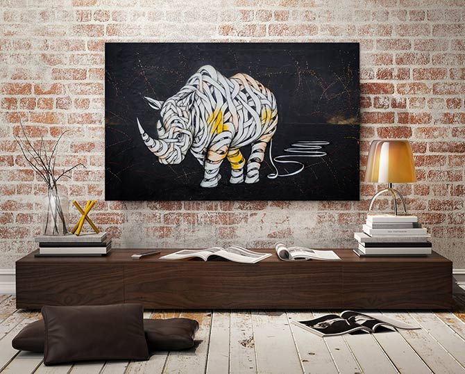
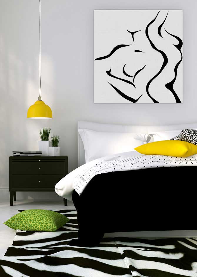
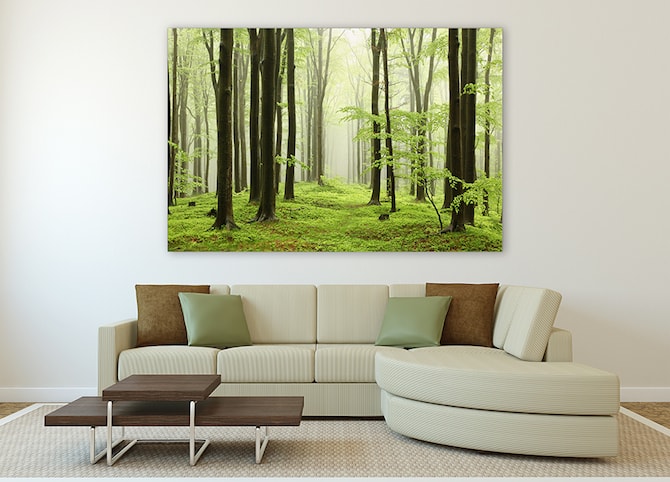
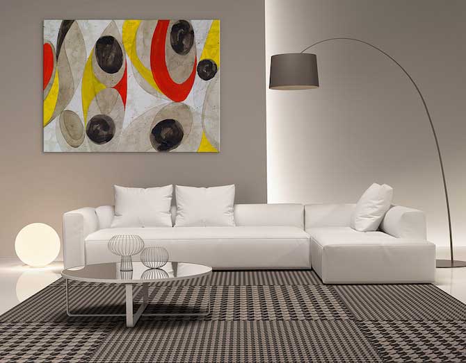
Adding artwork to your home is a nifty trick for cramped, plain interiors. It can provide a focal point, important symmetry and set the tone. This is why it’s also a disaster to get wrong! Do the rounds to establish what you like in a wall display before you make a purchase. There’s an abundance of options out there; a Forest Landscape? Abstract Portrait? Printed Photograph? Pristine Beach? Take your pick!
Expressions of creativity should be selected because they mean something to you or evoke a feeling. Not to mention pop some much-needed colour into your palette! And the final benefit of a large canvas print in a small room? It adds another layer of detail and depth to the space.
3. Careful of your curtains
The humble, much-loved curtain is actually your best friend when it comes to creating an ambience and keeping nosey neighbours out! Most smaller rooms tend to be a bathroom, home office or walk-in robe. Naturally, these rooms require a degree of privacy and seclusion, which explains the absence of large glass panels to beckon the outside world.
In this instance, sheer curtains can distort the perception of size when hung strategically. Choose a floor-length design and install them as close to the edge of the frame as possible. This not only enhances the size of the window but draws attention to the natural light. By choosing a long-line drape you can also increase the height and presence of the room.
4. Multi-purpose everything
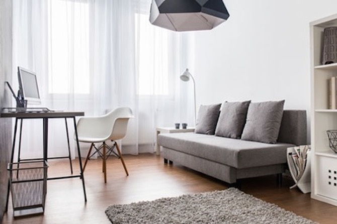
A compact interior means that absolutely everything within the space matters, so furniture needs to be functional as well as beautiful.
A wide side table can double as a desk and shelving under window seats are a must-have.
Of course, with the rise of apartment living, there has been an onslaught of innovative storage solutions, making the trend more accessible than ever. Giant department stores like IKEA make it only too easy to give you room to move wherever you are.
5. Mismatched furniture
Colour blocking is a great way to divide space in a style that is modern, fun and interesting! If you segment the height of a room with different tones, then it is likely to appear taller – especially if you introduce a gradient.
Mismatched cabinets are a relatively new trend and a firm favourite of custom homes. They can offer a somewhat bohemian feel for your kitchen, but always select a darker colour for the lower cabinets and benchtops, introducing lighter shades as you work your way up.
Many of today’s luxury homes will mix up the texture and palette for each room because it’s a great way to keep a hold of character pieces without overwhelming the space. The same is true for tiny interiors, so keep your mahogany tables and just remember to balance them out with light walls and decor.
6. Keep a low profile
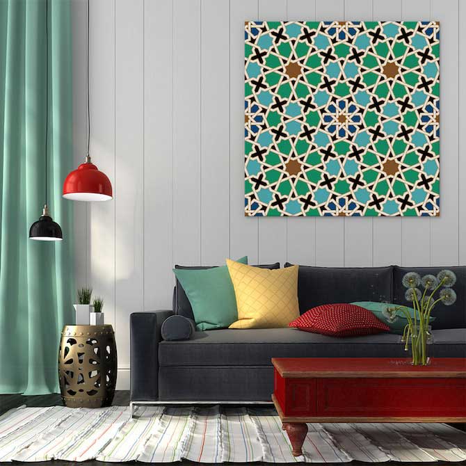
Furniture, I’m talking to you. Much of our perception of space comes from how far and how much we can see. This means that a room cluttered with tall objects will feel more cramped even if the floor space measures bigger. On the flip side, furniture that sits lower down and is organised gives a room ‘flow.’
So, what’s flow? It’s that feeling of calm and belonging that indicates this is a room that is liveable. Flow can be attributed to a number of things, but the most important element is proportion. You wouldn’t try to squeeze a King bed into a room that can hardly fit a sofa. That leaves the occupant wondering why the room doesn’t feel like a bedroom. Be sure to get familiar with your space and take measurements before purchasing any core furniture.
7. Extend the room outside
For those who have enough budget to make serious structural changes, extending a room to the outdoors is a completely winning move. Open, spacious design is often inspired by the outdoors and the elements, so why not make your house a part of that? Run the wooden flooring in your kitchen out to the decking and keep your hardware minimal for a clear link between each zone.
This is also an excellent opportunity to encourage ventilation and natural sunlight throughout your home, which brings with it an ‘airiness’ year round. A healthy home is a happy home regardless of size. Even if you do live in a tiny house, clever interior design means the world can still be yours.
Author Bio
As Managing Director of Mazzei Homes, Australia’s leading luxury home builder, Daniel Mazzei has a strong ambition to innovate the building experience for those looking to build quality homes. Offering all clients his expertise in custom home design.

